
Designing for Someone Moving at 70 mph

Most graphic design gets a generous user. They can stop. Lean closer. Scroll back. Read again.
A road sign gets a car.
The viewer may be moving at motorway speed, in rain, at night, surrounded by other vehicles, while making a decision whose exit will disappear in seconds.
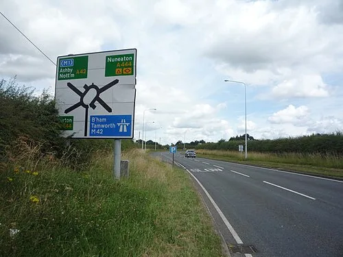
In the late 1950s and early 1960s, Britain’s growing motorway network exposed the limits of its old road signs. The system had accumulated local styles, uppercase lettering and inconsistent conventions.
Graphic designers Jock Kinneir and Margaret Calvert helped create a new visual language: clear typefaces, colour-coded road categories, consistent spacing, pictograms and rules that worked across the country.
The result is so familiar that it barely looks designed. That invisibility is the achievement.
The idea in 20 seconds
- Readability belongs to the environment, not merely the typeface.
- A system becomes intuitive when the same visual rules work repeatedly.
- Recognition is faster than interpretation.
- Good public design often succeeds by becoming ordinary.
A road sign is not a poster beside a road. It is a decision placed inside speed, distance, weather and limited attention.
The old signs belonged to slower roads
Britain’s earlier signs had developed over decades. Different organisations and local authorities used varying styles, and fingerposts worked reasonably well at lower speeds and on smaller networks.
Motorways changed the task. A driver needed to identify a destination, understand the road hierarchy, choose a lane and act, all while the sign rapidly approached and disappeared.
The Anderson Committee was established in 1958 to consider motorway signs. The Worboys Committee followed in 1961 to review the broader national system. The eventual redesign adopted larger signs, clearer symbols and a more consistent visual grammar. Conversion began in the mid-1960s, and the basic system remains familiar today.
This was not a logo refresh. It was a redesign of how a country gave instructions at speed.

Typography became an engineering material
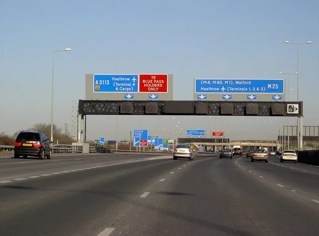
Kinneir and Calvert developed the Transport typeface for road signs. Its job was not to express a fashionable national personality. Its job was to remain distinguishable from a distance and at speed.
Letterforms, word shapes, stroke widths, spacing and contrast all affected the amount of time a driver needed to read.
The designers favoured mixed-case lettering rather than setting every destination in capitals. Lowercase letters create more varied word shapes, and ascenders and descenders, the tall and hanging parts of letters, give words recognisable silhouettes.
At speed, the driver does not lovingly inspect every character. They recognise a shape. Typography becomes perception engineering.
The sign begins long before the sign
A road sign cannot be judged as a rectangle in a design file. Its real interface includes:
- how far away it first becomes visible,
- the speed of the vehicle,
- surrounding visual clutter,
- weather and lighting,
- the number of destinations,
- the decision time after reading,
- and whether the sign appears consistently with previous signs.
This is why a beautiful sign can still fail. If it is placed too late, contains too much information or uses a surprising convention, visual quality cannot recover the lost seconds.
Context is part of the component.
Colour carried categories, not decoration
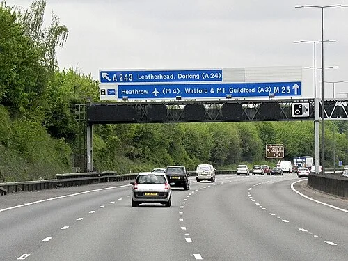
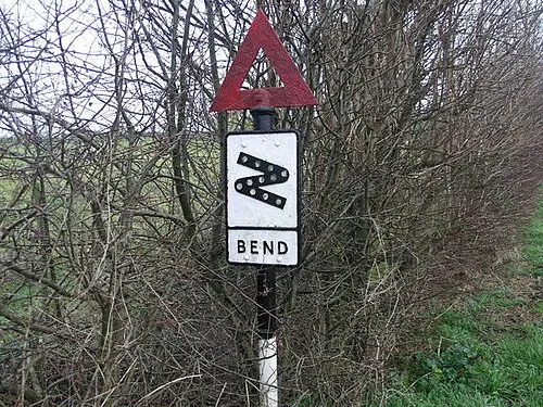
Different background colours helped drivers recognise the type of road and information before reading every word. Blue became associated with motorways. Green is used on primary routes. White appears on local direction signs, with additional panels and colours carrying specific meanings. Warning signs use red triangles, and prohibitions commonly use red circles.
The shape and colour establish the sentence type:
Warning.
Prohibition.
Direction.
Only then does the specific symbol or wording complete the message. This is efficient because the system layers information: the user recognises the category first and interprets the detail second.
Software often does the same with colour, position and icon shape, but less consistently. When every notification uses a different visual grammar, users must read from zero each time.
Consistency creates borrowed learning
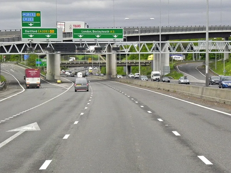
A driver learns one warning triangle and gains a clue about every other warning triangle. They learn that motorway direction signs are blue and carry that expectation across the country.
This is borrowed learning. The system invests in teaching a rule once, then reuses it.
Good interface systems work similarly:
- destructive actions share a treatment,
- navigation stays in a predictable region,
- errors use the same structure,
- primary actions look related,
- status colours keep the same meaning.
Consistency is not about making every screen look identical. It is about allowing knowledge from one moment to reduce effort in the next.
The best sign contains restraint
Every additional destination feels useful to the person adding it. To the driver, every word consumes time.
Road-sign design therefore exposes a universal product tension:
The system wants to say everything. The user needs to know what matters now.
A sign must omit. It cannot explain the history of the route, every future turn and every nearby landmark. It presents enough information for the next safe decision.
Products frequently confuse completeness with helpfulness:
- dashboards show every metric,
- onboarding explains every feature,
- settings expose every configuration,
- error messages include every technical detail.
The road sign asks a more disciplined question:
What can this person use before the moment passes?
The 70 mph test
For any time-critical interface, ask:
How long does the person truly have?
Measure exposure and decision time, not only reading speed.
Can the category be recognised before the details?
Use consistent shape, colour and placement.
Does information arrive early enough to act?
Clarity delivered too late is failure.
What can be removed?
Every element competes with the decision.
Does prior learning transfer?
Use the same grammar across the whole system.
Has it been tested in the real environment?
Distance, glare, movement, stress and distraction belong in the test.
One final thought
Britain’s road signs are admired by designers, but most drivers do not think about Margaret Calvert, Jock Kinneir or the Transport typeface while approaching an exit. They read the destination and move.
That is what successful public design often looks like. It does not demand to be noticed. It gives attention back quickly enough for the person to use it elsewhere.
Great information design is not information made beautiful. It is a decision made possible.
The road-sign system did not merely standardise signs. It standardised moments of understanding across an entire country, one glance at a time.
Sources and further reading
More writing
 systems designinformation design
Arm the Believer Inside
In a big organisation you rarely win the room yourself. You find the believer inside it, and arm them to win it for you.
 systems designinformation design
Finalised Isn't Final
We signed off a Diwali design for TUMI. Then a VP pulled it back. A quiet lesson about where design decisions really get made.
 systems designinformation designinteraction design
How Do You Design a Democracy for 173 Million People?
India's first general election was not only a political achievement. It was a vast exercise in inclusive system design.