A City Compressed Into Four Characters

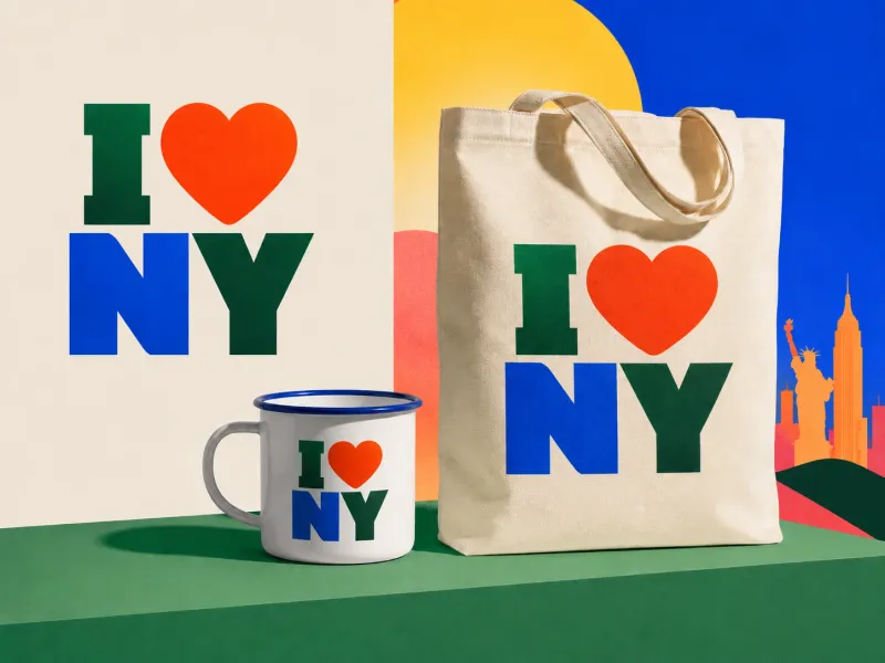
I ❤️ NY
Four characters. One of them is not even a letter.
Milton Glaser created the mark in 1977 as part of a New York State tourism campaign. New York City was facing a financial and reputational crisis, and the campaign was meant to encourage people to visit.
It could have said:
New York offers world-class cultural attractions, natural beauty and entertainment.
Instead, it gave people a sentence about themselves. I love New York.
The logo did not describe the place. It let the viewer declare a relationship with it. That small shift helped turn an advertisement into a piece of public language.
The idea in 20 seconds
- Strong identities give people something to say, not only something to recognise.
- Compression works when the audience can reconstruct a larger meaning.
- A symbol becomes culturally powerful when people can copy, adapt and inhabit it.
- The most durable brand asset may be a grammar rather than a fixed graphic.
The logo succeeded because New York was not the speaker. The person wearing the T-shirt was.
The campaign needed more than a logo
The identity was one part of a larger tourism effort developed for New York State. The advertising agency Wells Rich Greene created the campaign, and composer Steve Karmen wrote the accompanying song. Glaser contributed the now-famous mark, reportedly developing the stacked version after an initial concept.
The visual equation was simple:
I + heart + NY
The heart functioned as both image and verb. The viewer did not need to read “love.” They performed the substitution instantly, and that moment of decoding created participation.
The audience completed the message.
Compression is not the same as minimalism
The logo contains very little, but it carries a surprising amount: a speaker (I), an emotion (love), a place (New York), and a tone that is direct, personal and optimistic.
Nothing feels ornamental. But the power does not come from having fewer elements for its own sake. It comes from maintaining meaning while removing material.
That is compression. Minimalism can merely make something sparse. Compression makes something dense.
The difference appears in interface design too. A good icon compresses an action people already understand. A useful summary compresses a large dataset while preserving the decision. A strong navigation label compresses an entire section into one phrase.
Removing words is only successful when meaning survives.
It is written in the first person
Many place identities speak from the organisation:
Visit us.
Discover New York.
The world’s greatest destination.
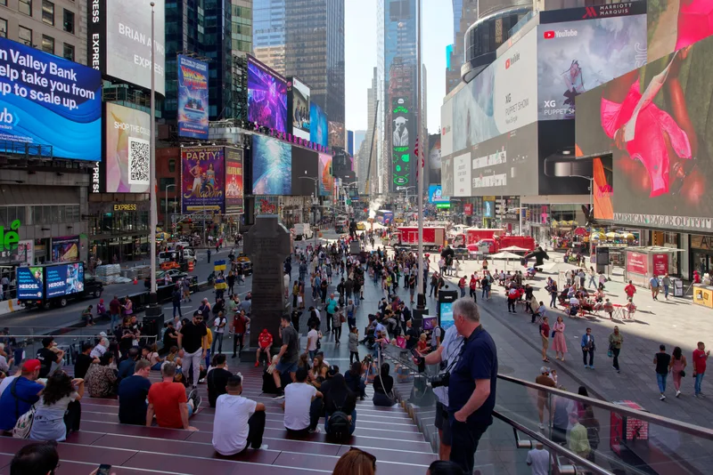
I ❤️ NY hands the sentence to the audience. The tourist can say it. The resident can say it. Somebody who has left can say it, and somebody who has never visited can aspire to say it.
This is why the mark works naturally on a T-shirt. The wearer becomes the subject of the sentence. The merchandise does not only display a brand; it broadcasts a personal claim.
The logo behaves less like an institutional badge and more like a status update. Decades before social media, it was designed to be posted on a body.
A logo people could rewrite
The structure has been copied endlessly:
I ❤️ [place]
I ❤️ [person]
I ❤️ [thing]
Most brand guidelines treat imitation as dilution. In this case, imitation demonstrated that the design had become a grammar. People understood where the variable lived. They could replace New York and preserve the sentence.
This is similar to a meme, a template or a reusable interface pattern. The original becomes culturally useful because it can generate versions.
The identity was no longer only an image owned by a campaign. It was a format people used to express affection.
It could carry grief too
After the attacks of 11 September 2001, Glaser created a modified version:
I ❤️ NY MORE THAN EVER
The heart carried a dark mark, reflecting the wound to the city. The adaptation worked because the original identity had already accumulated emotional meaning. It could move from tourism to solidarity without needing to explain the connection.
This reveals a difficult quality of lasting identities. They need enough specificity to be recognisable and enough openness to hold meanings their creators could not predict.
The design does not remain timeless by refusing to change. It remains alive because people can change with it.

The city and the state
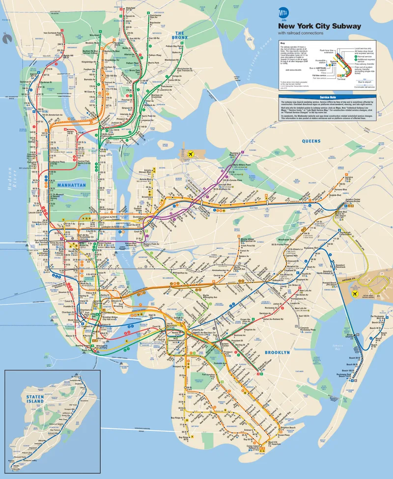
An interesting detail is often lost in memory: the campaign promoted New York State, not only New York City. Yet the letters “NY” allowed both readings, and that ambiguity helped.
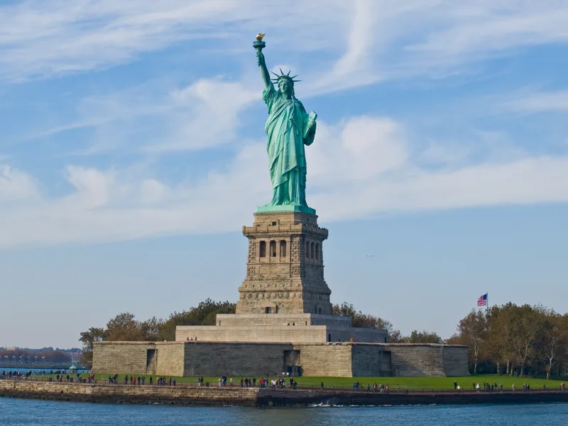
The mark could refer to a state, a city, an idea of urban energy or a personal memory. It did not contain a skyline, yellow taxi, Statue of Liberty or state outline that would narrow the interpretation.
By avoiding a literal landmark, the identity left room for each person’s New York. Sometimes the most inclusive image is the one that does not decide the picture for you.
The identity test
For any brand meant to enter culture, ask:
Who is speaking?
Can the audience use the message in their own voice?
What does the viewer get to complete?
Participation creates memory.
Is it minimal or compressed?
Remove elements only if the remaining form still carries the idea.
Can the structure generate new expressions?
A grammar can travel further than one fixed asset.
What meanings could it hold later?
Leave enough room for people and events to add significance.
Does the symbol rely on recognition or explanation?
The best cultural marks can be understood before the campaign copy arrives.
One final thought
Cities are too large for logos. New York contains millions of people, neighbourhoods, contradictions, memories and versions of itself. No mark could describe it honestly.
Glaser did something smarter. He did not compress New York. He compressed the relationship between a person and New York.
That relationship could be printed, worn, copied, parodied, mourned and renewed.
The most powerful identity may not tell people what a place is. It may give them a way to say what the place means to them.
I ❤️ NY looks like a logo. It behaves like a sentence. And the reason it survived is that millions of people were happy to become its speaker.
Sources and further reading
More writing
 information designinteraction design
The Graveyard Won
The idea I threw away became the whole system. A story about showing your rejected work, and why clients love the reject you buried.
 usabilityinteraction designinformation design
The Day Your Interface Disappears
Ten principles for making software feel less like an interface and more like instinct.
 systems designinformation designinteraction design
How Do You Design a Democracy for 173 Million People?
India's first general election was not only a political achievement. It was a vast exercise in inclusive system design.