
The Day Your Interface Disappears

The highest compliment a user can give your app is not:
“This interface is beautiful.”
It is:
“I didn’t even think about it.”
That is the strange ambition of interface design. We spend weeks choosing buttons, spacing, motion, copy and flows, only to make all of it disappear from the user’s attention.
The interface is still there. The user simply stops experiencing it as an interface. It becomes instinct.
The idea in 20 seconds
An app starts feeling intuitive when it:
- asks people to remember less,
- makes the next action obvious,
- puts controls where people expect them,
- lets people manipulate things directly,
- responds immediately,
- behaves consistently,
- makes mistakes reversible,
- removes decisions that do not matter,
- teaches through interaction,
- and uses movement to explain space.
The goal is not merely fewer clicks. The goal is fewer moments of hesitation.
We have already seen this happen
Pinch to zoom was once a new interaction. Today, people perform it without thinking. Some children even try pinching printed photographs, expecting the image to grow.
Scrolling has become equally automatic. Nobody consciously thinks I will now move my thumb upwards so the content travels vertically. They simply scroll. The same is true for copying and pasting, pulling down notifications, double-tapping a photograph and swiping a screen away.
These actions were once designed. Then they were demonstrated, then repeated, and eventually they stopped feeling like design at all. They became part of how we move.
That may be the real goal of intuitive design: not making an interface easy to understand, but making it unnecessary to think about.
So how does an app reach that point?
1. Do not make people remember
A difficult product asks:
“Do you remember how this works?”
An intuitive product asks:
“What are you trying to do?”
Good interfaces carry information on behalf of the user. They reduce the number of details a person must store, recall or calculate before taking action.
Real-life example: Google Maps
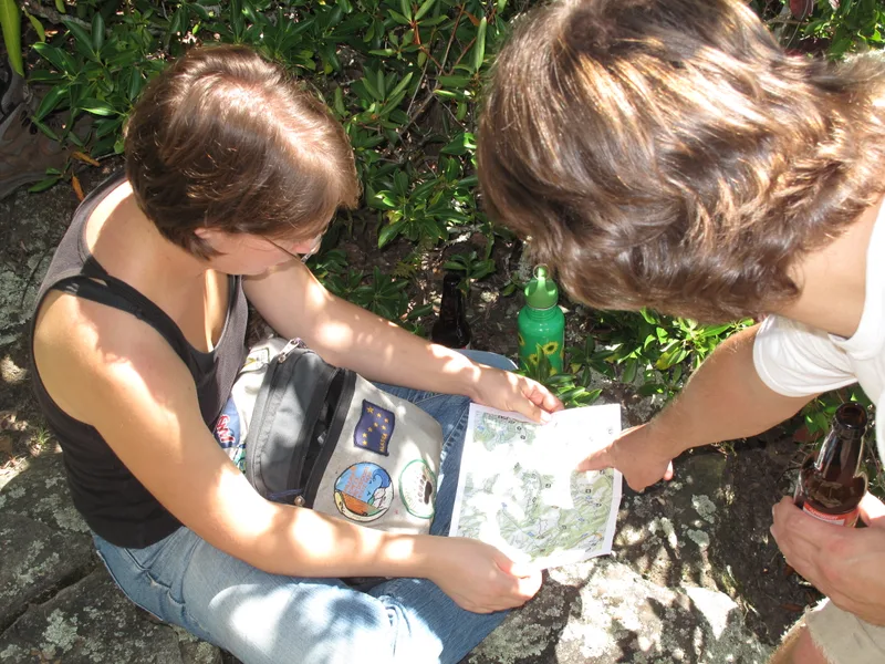
Before navigation apps, travelling somewhere unfamiliar often meant remembering road names, landmarks and turns. Google Maps carries that mental load for you. You enter the destination, follow the blue line and listen for the next instruction.
The user remembers only the intention: I want to get there. The product remembers the route.
Other familiar examples
Your phone’s contact list means you remember a person instead of their number. A password manager remembers dozens of passwords. YouTube remembers what you recently watched. A food-delivery app remembers your address and previous orders.
The general principle is simple:
The product should remember the system so the user can remember the goal.
2. Give every screen one obvious next action
People should not have to stop and solve the interface. Every screen should quietly answer:
“What should I do next?”
This does not mean every product must have only one button. It means one action should feel clearly connected to the user’s current intention.
Real-life example: Uber
When you open Uber, the app begins with one main question: “Where to?” Once you choose the destination, you select a ride. Then you confirm it.
The flow mirrors the shape of the task: choose destination, choose ride, confirm, travel. There are multiple steps, but very little uncertainty.
This is why reducing hesitation is often more valuable than reducing clicks. Five obvious actions can feel faster than two confusing ones.
Other familiar examples
Google Pay and PhonePe generally guide users through a simple flow: choose person, enter amount, confirm payment. Airline check-in follows a similar pattern: confirm passenger, choose seat, receive boarding pass. Duolingo shows one exercise at a time rather than presenting the entire lesson at once.
The enemy is not always effort. The enemy is often the moment when the user pauses and asks:
“Now what?”
3. Put things where people expect them
Familiarity is one of the fastest paths to intuition.
People expect search to look like search. They expect the back action near the top of the screen, primary navigation near the edges, and a shopping cart near the top-right corner of a website. There may be no natural law saying these controls must live there, but repetition has turned those locations into expectations.
Real-life example: The shopping cart
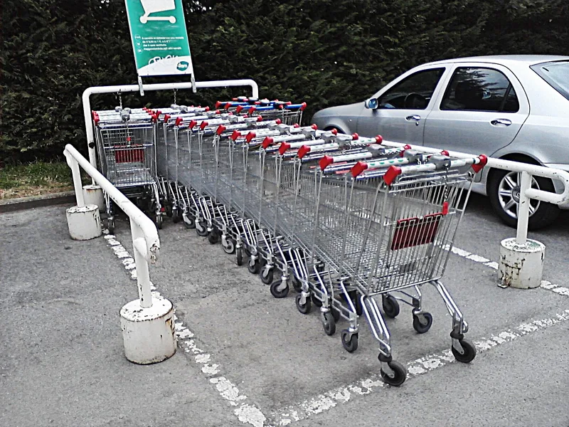
Open Amazon, Flipkart or almost any online shop. The cart is usually placed near the top-right.
A designer could move it somewhere more creative. But creativity would force the user to search, and the familiar location removes that search entirely. The hand begins moving before the mind finishes asking where the cart is.
Other familiar examples
A logo in the top-left usually returns you to the home page. A magnifying glass usually means search. Three dots usually reveal more options. Bottom navigation on mobile often contains home, search and profile.
Predictability can feel boring to the person designing the interface. To the person using it, predictability feels effortless.
Familiar placement turns visual search into muscle memory.
4. Let people act directly
The closer an action feels to the object, the easier it is to understand.
Dragging something feels more natural than opening a menu and selecting “Move”. Pinching an image feels more natural than pressing separate zoom buttons. Pulling the edge of a photograph feels more natural than entering crop dimensions.
Direct manipulation removes translation between intention and action.
Real-life example: Rearranging apps on a phone
To move an app icon, you do not open a settings menu and choose “Change application position.” You hold the icon and drag it to the place you want. You manipulate the object itself, and the action on the screen resembles the action in your mind.
Other familiar examples
On Google Maps, you drag the map in the direction you want to explore. In Tinder, the card itself becomes the decision. In Canva, you drag text and images around the canvas. In a photo editor, you pull the crop boundary instead of typing measurements.
The strongest interactions often feel less like giving instructions to a machine and more like touching the result directly.
Do not make the user describe the action when they can simply perform it.
5. Respond immediately
An interaction becomes easy to learn when cause and effect sit close together. The person taps, the product reacts, and the brain connects the two.
This is why feedback matters. It tells the user, “I noticed your action.” Without clear feedback, people tap again, hesitate or assume the app has stopped working.
Real-life example: Pull to refresh
When you pull down on a feed, the page moves with your finger. A loading indicator appears. The content updates.
That short sequence tells you three things: the app noticed the gesture, it understood what you wanted, and it is working on it. Imagine the same gesture without movement or a loading indicator. You would probably pull again.
Other familiar examples
Instagram shows a heart immediately after a double tap. Payment apps display a clear success screen, animation or sound. Buttons often compress slightly when tapped. Phones may provide a small vibration when an action is completed. Upload bars show that a file is still moving.
Motion is useful here not because it makes the app look expensive. It is useful because it explains what happened.
Feedback turns an action into a conversation.
The user acts. The interface replies.
6. Make repetition feel identical
Muscle memory depends on consistency. When the same action produces the same result repeatedly, the user gradually stops thinking about it. When an action changes meaning between screens, the learning resets.
Real-life example: Double tap to like on Instagram
Once a person learns that double-tapping a post means “like”, the interaction remains stable across photographs, videos and accounts. The relationship is consistent, so the user no longer searches for the heart button. Their thumb already knows what to do.
Other familiar examples
Command + C or Control + C copies text across thousands of applications. The spacebar pauses and resumes videos on many desktop players. Pinch to zoom works across photographs, maps and documents. Pull to refresh appears across social, news and email apps.
The interaction does not have to be original. It has to be dependable.
Instinct is repetition without surprise.
If the user learned something yesterday, it should still work today.
7. Make mistakes cheap
People learn faster when they are not afraid. A product that punishes every mistake creates hesitation. A product that allows recovery creates confidence.
When actions are reversible, people explore. Through exploration, they learn. Through repetition, the interaction becomes familiar.
Real-life example: Gmail’s Undo Send
After you send an email, Gmail briefly shows an Undo option. That small feature changes how the action feels. A missing attachment, wrong recipient or unfinished sentence is no longer immediately permanent.
The feature does more than prevent mistakes. It reduces fear before the user acts.
Other familiar examples
Deleted photographs remain in a Recently Deleted folder. Google Docs keeps version history. WhatsApp allows some messages to be deleted after sending. Shopping carts let users change quantities before paying. Undo in creative tools encourages experimentation because actions are not final.
A forgiving product helps users move confidently. An unforgiving product teaches them to move slowly.
Confidence is often a design feature.
8. Remove decisions that do not matter
Every decision consumes attention. Which file type? Which folder? Which resolution? Which format? Which mode? Which permission?
A product may technically offer freedom while making the user perform unnecessary administrative work. Good design protects attention for decisions that actually matter.
Real-life example: The phone camera
Open the camera on your phone. It is already ready to take a photograph. You do not need to choose a file name, storage location, compression level, colour profile or image format.
Those decisions still exist somewhere in the system. The product simply handles them quietly, and the main action remains obvious: point and shoot.
Other familiar examples
Uber suggests Home and Work. Payment apps show recent contacts. Food-delivery apps let people reorder previous meals. Browsers autofill names, addresses and payment details. Streaming services continue from the point where you stopped watching.
This is not about removing all control. It is about removing choices that do not deserve attention in that moment.
A useful default is a decision the user does not need to make again.

9. Teach through the interaction
Many products try to teach people through tutorials. But tutorials are often skipped, forgotten or dismissed. A stronger interaction teaches itself while it is being used.
Real-life example: Slide to unlock
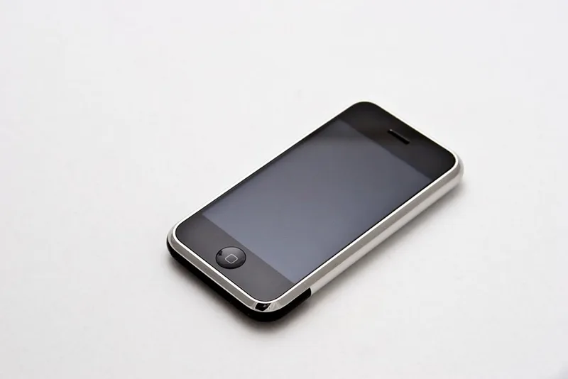
The original iPhone’s slide-to-unlock control did more than display an instruction. The text, arrow and moving object all suggested the same physical action. The user learned by performing the gesture, so the lesson and the action happened together.
Other familiar examples
A carousel shows part of the next card, suggesting that the screen can move sideways. A drag handle suggests that an object can be moved. A progress indicator shows how many steps remain. An empty state explains what action will populate the screen. A pull-to-refresh animation moves with the user’s finger and demonstrates the behaviour.
The interface itself can be the instruction.
The best tutorial is often the first successful action.
10. Use movement to explain space
Screens are flat, but interfaces often behave as if they contain rooms, layers and objects. Motion helps people understand where things came from, where they went and how different screens are connected.
Real-life example: Opening an app on a phone
When an app opens, its window appears to expand from the icon. When the app closes, it seems to return towards that icon. The animation is not only decoration. It helps the user understand the relationship between the home screen and the app.
Other familiar examples
A card expands into a full page, showing that both views represent the same object. A deleted item slides away, communicating removal. A temporary panel rises from the bottom, suggesting that it can be dismissed. A mini-player expands into a full player while preserving the same album artwork.
Motion creates continuity. Without it, interfaces can feel like unrelated screens appearing and disappearing.
Good motion explains where the user is, not merely what the product can animate.
The instinct test
Here is a simple way to review an interaction.
Memory
Does the user need to remember information the product could remember?
Direction
Is the next action obvious?
Familiarity
Is the control where people expect it to be?
Directness
Can the user act on the object itself?
Feedback
Does the interface respond immediately?
Consistency
Will the same action behave the same way tomorrow?
Recovery
Can the user undo a mistake?
Decisions
Which choices are unnecessary?
Learning
Can the interaction teach itself?
Continuity
Does motion explain what changed?
The fewer moments in which a person must stop and interpret the product, the closer the interaction is to becoming instinct.
The three stages of an interface
Most successful interactions seem to pass through three stages.
First, we learn them
The interaction is unfamiliar. We see a demonstration, read a hint or copy someone else.
Then, we remember them
We know what to do, but still perform the action consciously.
Finally, we forget them
Not because the learning has disappeared, but because it has moved into the body. The user stops operating the product and starts completing the task, and the interface disappears from attention.
One final thought
Designers often ask:
“How can we make this feature easier to find?”
A better question may be:
“How can we make finding it unnecessary?”
The most intuitive product is not always the one with the clearest instructions. It is the one that needs fewer instructions every time it is used.
A person arrives with an intention, and the interface matches the shape of that intention. It remembers what should be remembered, presents the right action, responds immediately, behaves predictably and forgives mistakes. Before the person has time to think about the interface, the task is already complete.
That is the day software stops feeling like software and starts feeling like a habit.
More writing
 interaction designusability
Give Them the Win First
PepeJump handed every new player a reward before they'd done a thing. A note on why a number going up is the most reliable delight in UX.
 information designinteraction design
The Graveyard Won
The idea I threw away became the whole system. A story about showing your rejected work, and why clients love the reject you buried.
 usabilityinteraction designerror prevention
The Ballot That Made a Vote Point Sideways
What the butterfly ballot teaches us about alignment, error costs and the danger of interfaces that cannot confirm intent.