


TUMI × Reliance Brands,
Diwali,
designed for a
global brand
For Diwali, TUMI redesigned over 125 stores worldwide, including airport locations.
The work had to live across retail, gifting, and digital, without losing the brand's precision.

The
context
TUMI wanted a Diwali experience that felt rooted in India, but still unmistakably TUMI.
The design had to work across countries, cultures, and formats. From airport stores to customer gifting, from websites to emailers.
The
scope
Once the direction was locked, the system had to scale across almost every customer touchpoint.
Retail spaces.
Gifts.
Digital communication.
Everything needed to feel connected, without repeating itself.

Rejected
routes
Before arriving at the final direction, I explored multiple visual routes.
Some leaned more traditional.
Some were more graphic.
Some were deliberately restrained.
Not all of them were right for TUMI, but that process mattered.
The chosen
direction
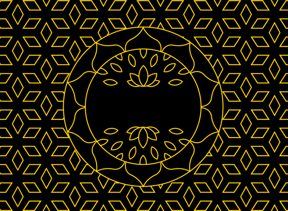
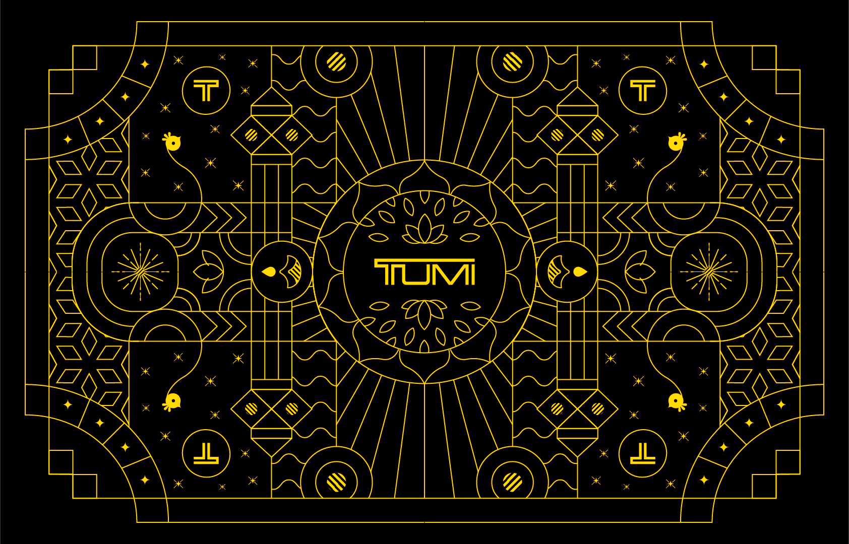
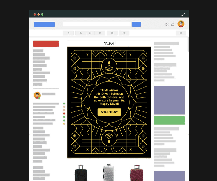
The selected route was built around a single key visual that could scale.
At the center sat the TUMI logo, treated as an anchor rather than decoration.
From there, the world expanded outward.
Visual
language
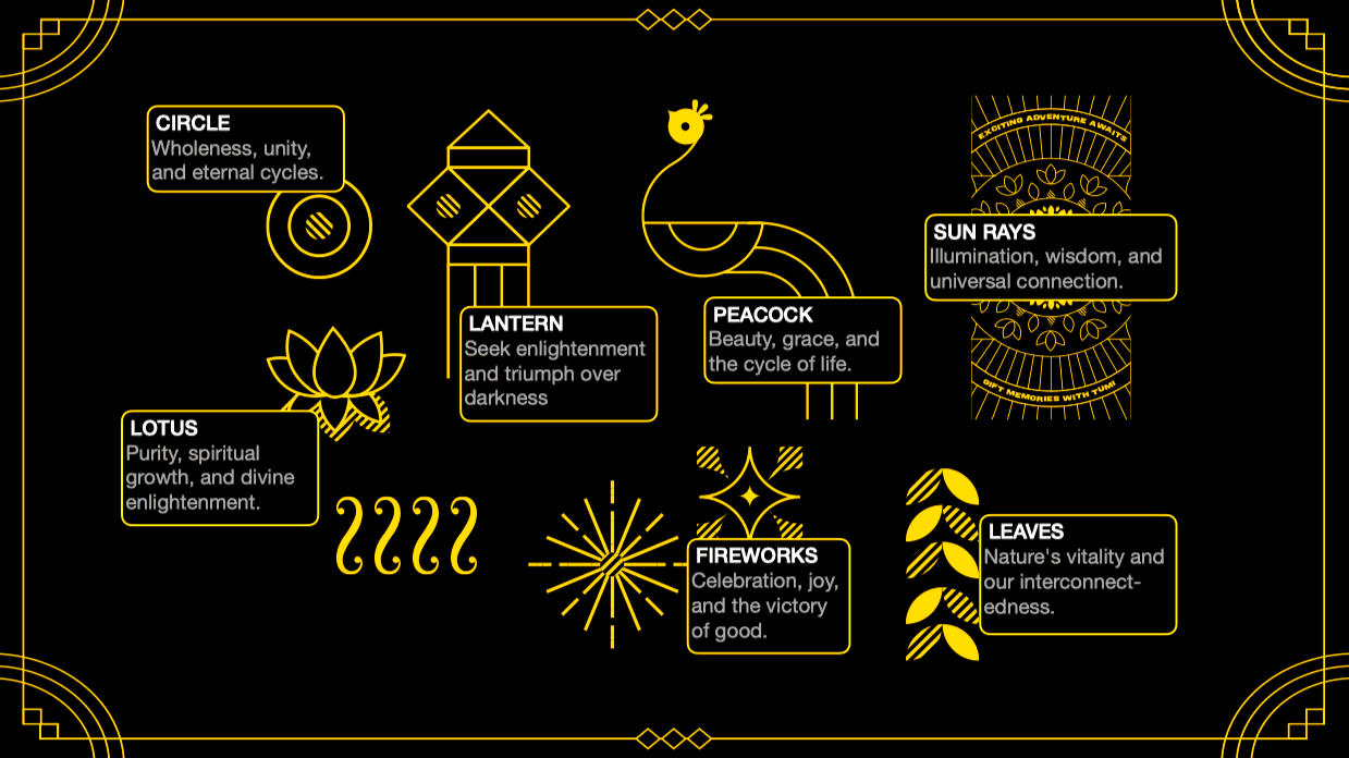
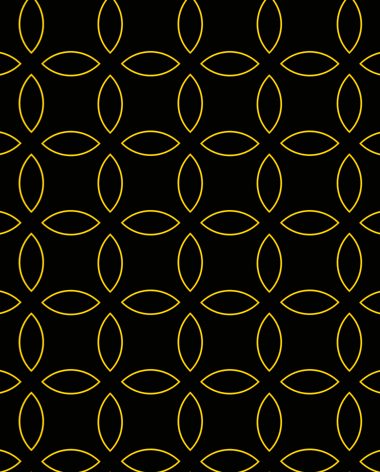
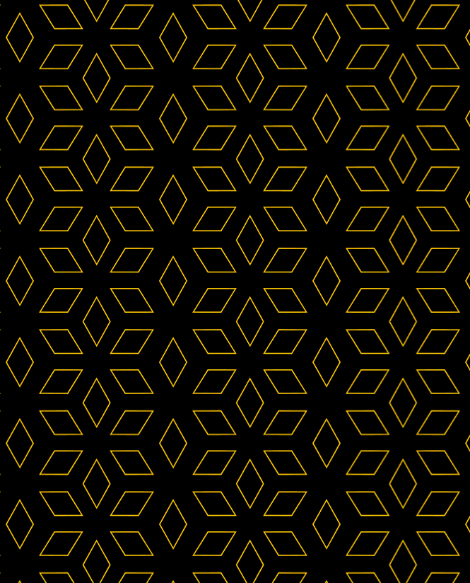
The artwork drew from Indian visual traditions, block printing, mandalas, and ornamental patterns, but was simplified to work globally.
The goal wasn't to recreate Indian art.
It was to translate its sensibility into a modern retail system.
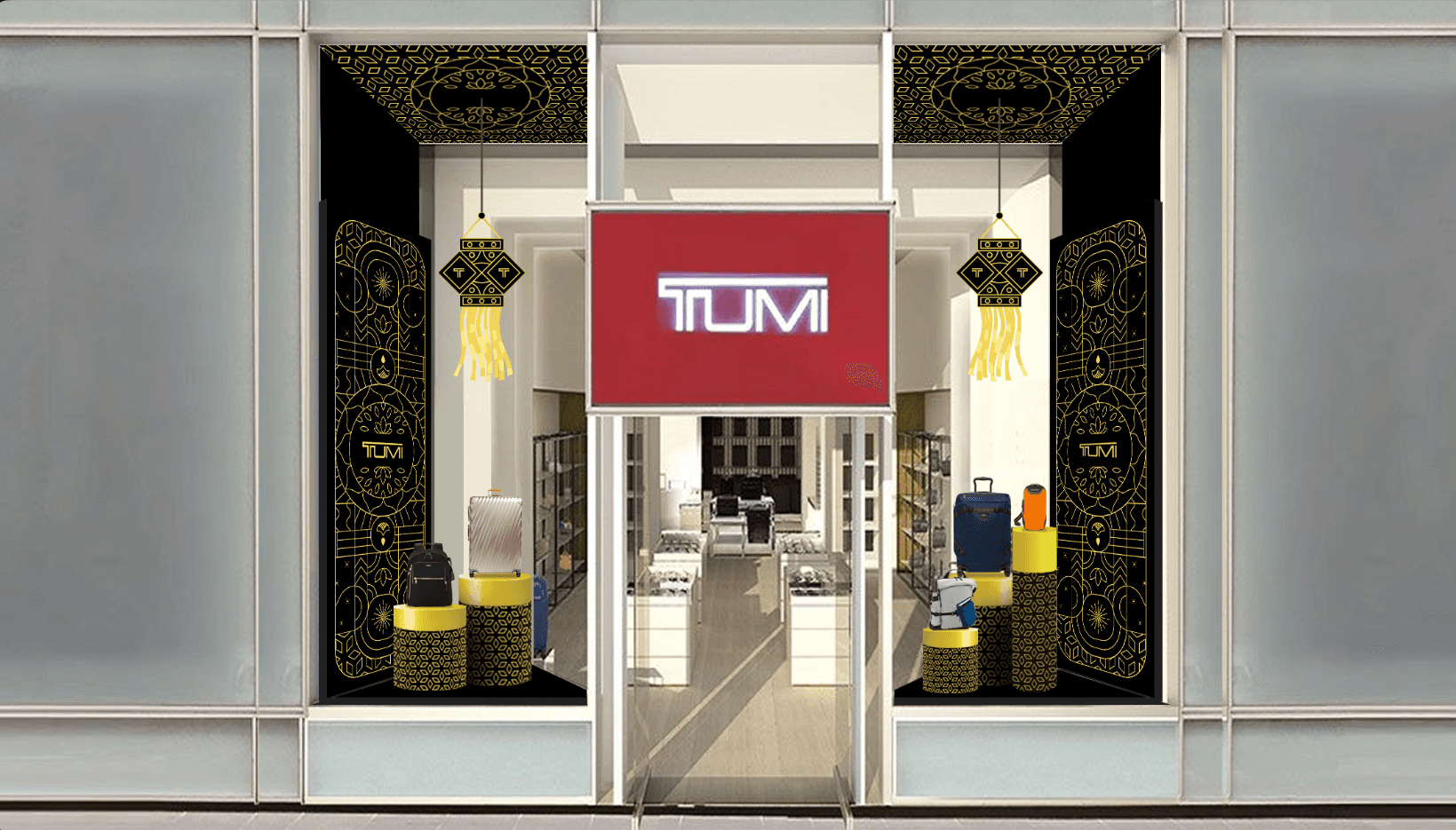
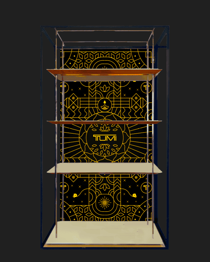
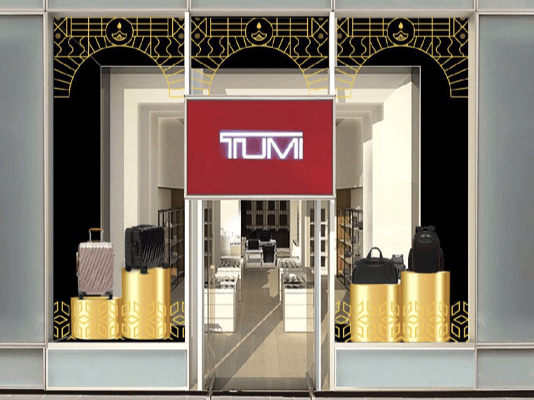
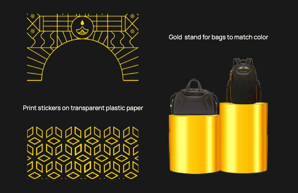
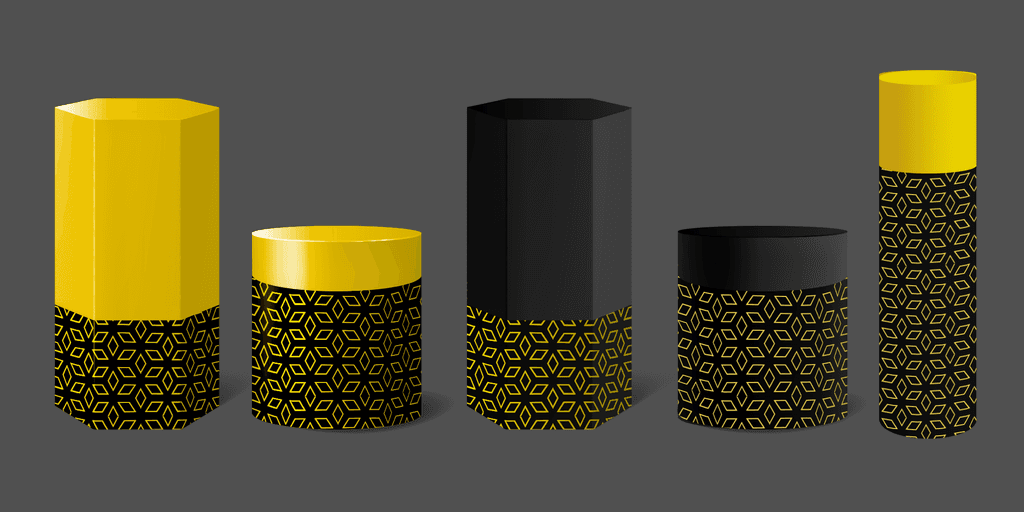
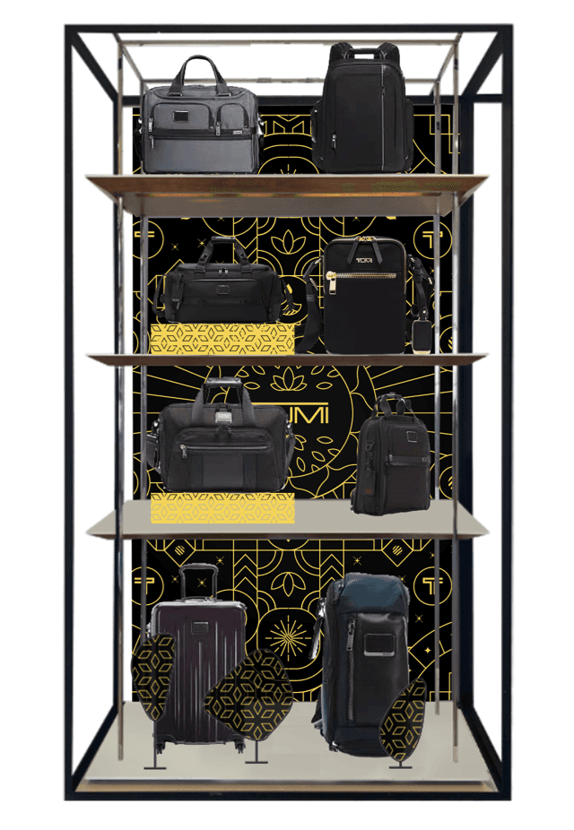
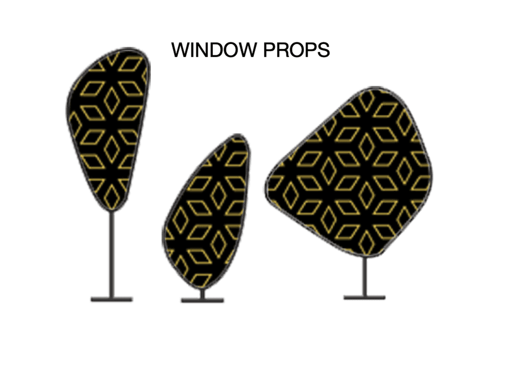
Retail
at scale
Retail was the hardest part.
The same system had to work:
in flagship stores
in smaller city stores
and in fast-moving airport environments
The visuals needed to read from a distance, and still hold detail up close.
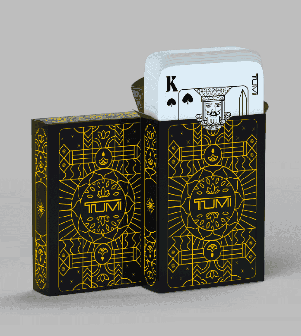
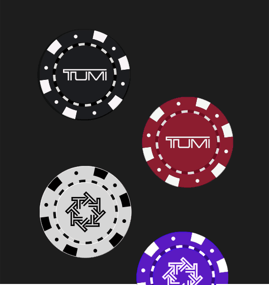
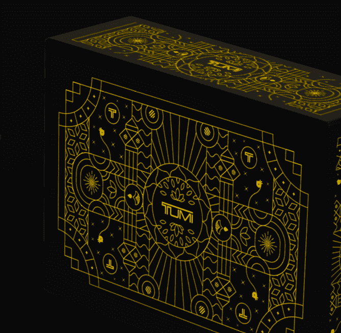
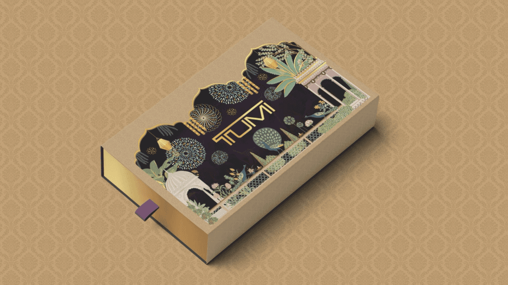
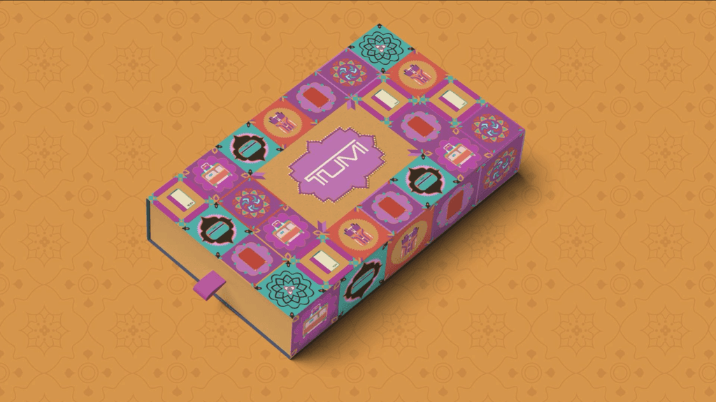
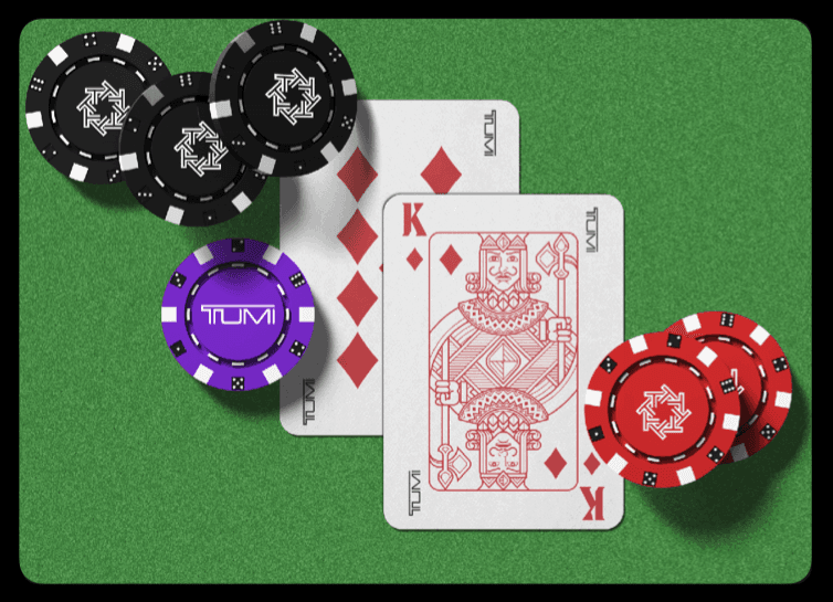
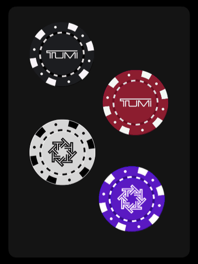
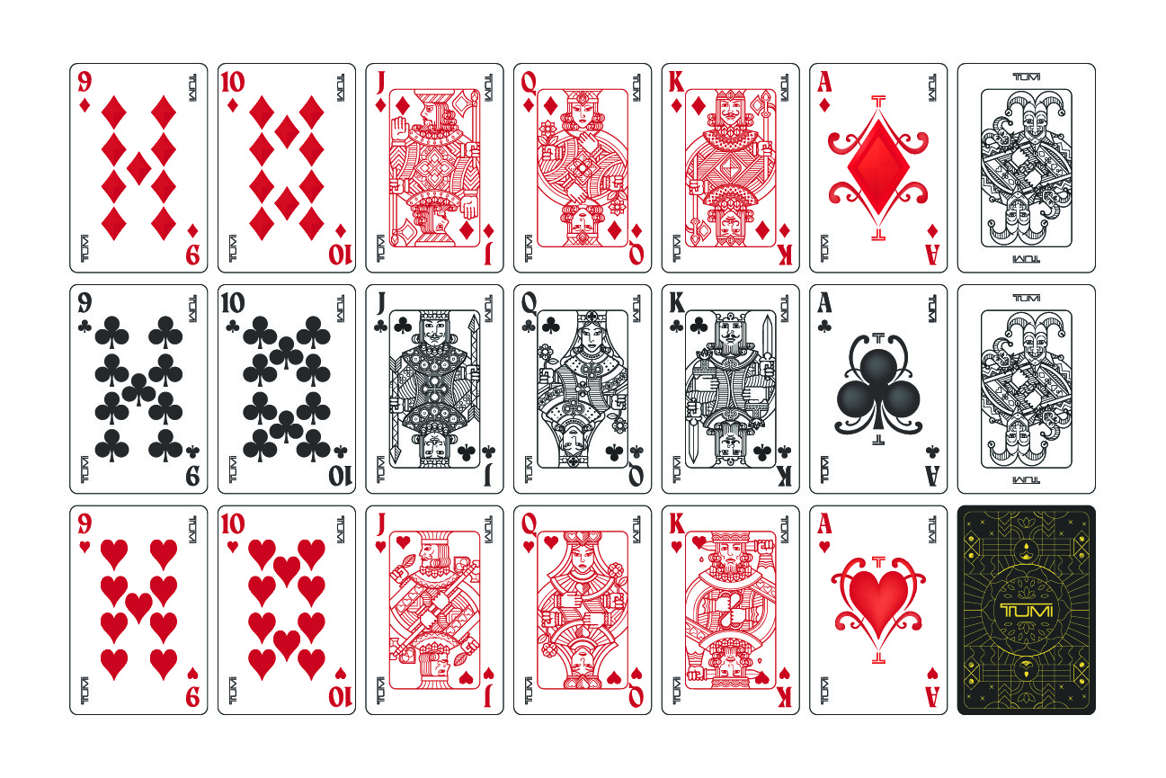
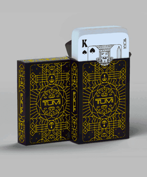
Gifting as an
object, not merch
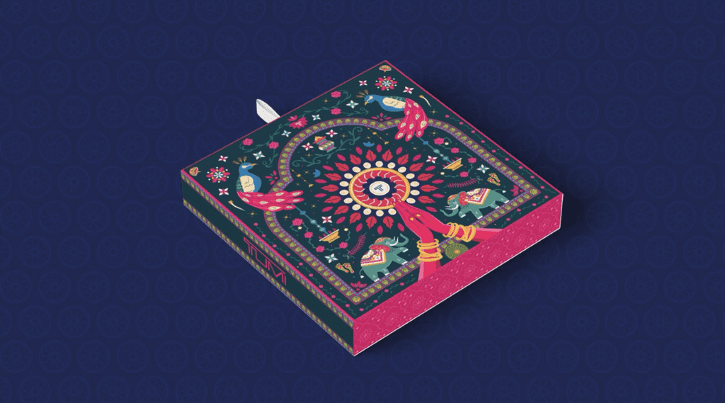
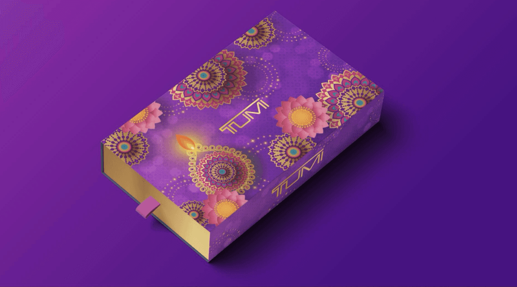
For gifting, the focus was on creating objects people would keep.
Poker chips, card boxes, playing cards, and greeting cards were designed to feel collectible, not seasonal.
They carried the same visual language, but in a quieter way.
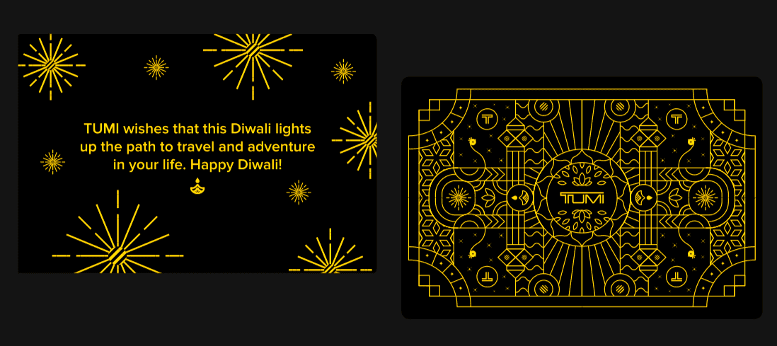
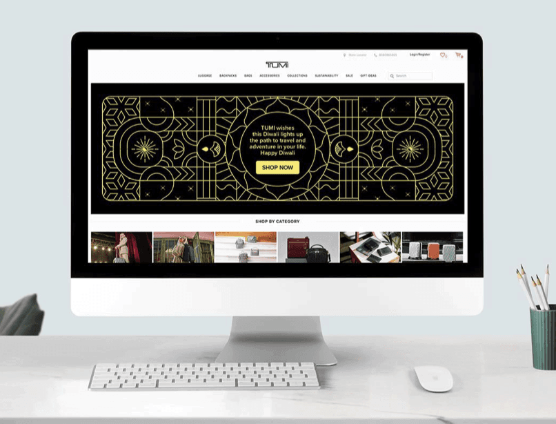
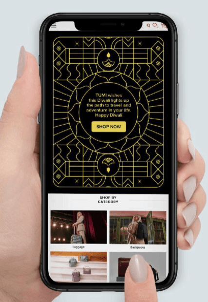
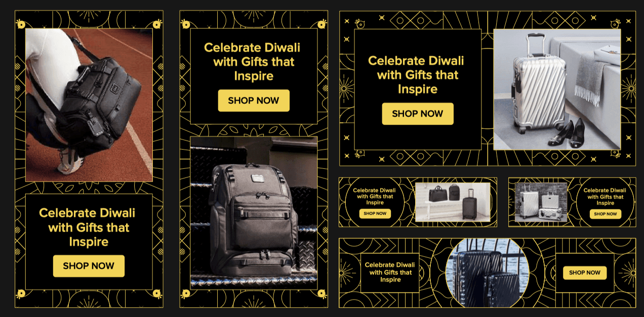
Digital
adaptation
The system had to hold together on screens as well.
Website banners, emailers, static ads, and animated greetings all used the same core elements, adjusted for speed and clarity.
Nothing new was introduced digitally.
The same language was simply adapted.


Reflection
This project reinforced something I've learned over time.
Cultural design for global brands isn't about symbols.
It's about restraint, judgment, and knowing what to leave out.
When that balance is right, the work travels well.
"This project involved multiple discussions, feedback loops, and alignment across teams. Sunny navigated all of it thoughtfully, listening carefully, responding with logic, and pushing back where needed. He helped bring everyone onto the same page while keeping the work strong and consistent."
Overview
Namrata Lodha (Deputy Marketing Manager)
Sana Bavkar (Marketing)
Senior team (Reliance Brands Limited)
Scope of work